

With a view to preparing it for a new era in the industry in South Africa, the Association for Communication and Advertising has unveiled its new logo and corporate identity.
“The industry has been on a journey to transform itself, a journey of inclusiveness. The launch of our new brand identity reflects this transformation from the perspective of the association. One that is undergoing a major overhaul of the entire organisation, its purpose, its offer, its activities and its visibility,” says Mathe Okaba, CEO of the ACA.
For years, the previous brand identity of the ACA has been synonymous within the industry of a voluntary organisation formed both by, and for, the profession. It is this very profession that is undergoing a transformation, redirecting not only the physical makeup of its members, but also how it is perceived and how it will approach the future in an all-inclusive environment. As the industry has taken on the transformation journey, so has the ACA. As a tangible symbol of this new approach, it became evident that the ACA was in need of a fresh visual identity.
At its core, the ACA believes in the power of creative leadership to drive sustainable change. It promises to protect its members, promote collective benefits and set policy. Within this, the ACA promotes commercial creativity, underpinned by transformation that empowers the industry to ensure a sustainable profession.


When the ACA was formed, both South Africa and the industry were in a very different space. Today however the space is characterised by a fragmented industry, a vastly different marketing environment and a weak marketing economy which has this year been exacerbated by a global pandemic. In an environment where there are questions related to the industry’s sustainability and one in which normative ethical behaviour has been eroded, the relevance of the ACA became an ever more pressing question.
With this in mind, the ACA has embarked on reinventing itself, with the updated rebrand reflecting the first iteration of its new purpose and positioning.
The brand identity is simply the ‘starter’ in the full menu of updated and targeted changes that the ACA will be making to the organisations relevance and offering to the industry. The new direction is constructed around the insight and belief that creative leadership drives change and inclusivity which delivers greater diversity. “We need to be more inclusive as a whole, from advertising through to design, from agency to freelancer and education. Diversity is a multiplier, and this will have a positive effect on the entire industry. We need to be an ingredient in all that the industry does, not an add-on,” adds Okaba.
The new brand identity was developed by Murmur, a dynamic, award winning creative agency whose specialities include branding, above the line solutions and brand extension.
The design reflects the overhaul the ACA is embarking on, while delivering a powerful visual execution of the association’s positioning and purpose. “We wanted to create a brand that not only reflects the new focus of the ACA, but also grants a platform for discussion and commentary on progression and transformation in the industry. We purposely steered away from a typical “ad-land” visual execution and applied a visual system that is slightly more editorial and thought provoking. At the end of the day, we needed to remember that the ACA is about having the hard conversations that drive the industry forward, and we wanted the visual language to reflect that,” says Shelley Atkinson, Executive Creative Director at Murmur.
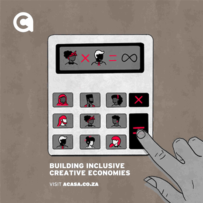
The new symbol is supported by an evocative visual language that uses bespoke illustrations to demonstrate key concepts in and around the industry. The brandmark has also been designed to work seamlessly with ingredient and partner brands, while carrying enough gravitas to stand proudly on its own.
“With our new purpose and objectives, the ACA intends to truly empower the creative economy. We want to build an industry that is inclusive, vibrant and full of colour. This is not simply a new look, but rather a completely new approach and we look forward to announcing further exciting changes and offerings in the weeks and months ahead,” concludes Okaba.


 rollout in South Africa will not negatively impact TAMS")


 Professionals Need to Mind their Language when Working in Africa")


